UX Designer
Figma
November 2019 - December 2019
The Project
How might we create a community that pairs willing and capable individuals with the elderly that need help?
Overview
During my fall term of my 4th year, my class had a capstone project based on set amount of topic briefs and my team chose "Healthy Routes." Our goal was to make activities more accessible to the elderly through a community.
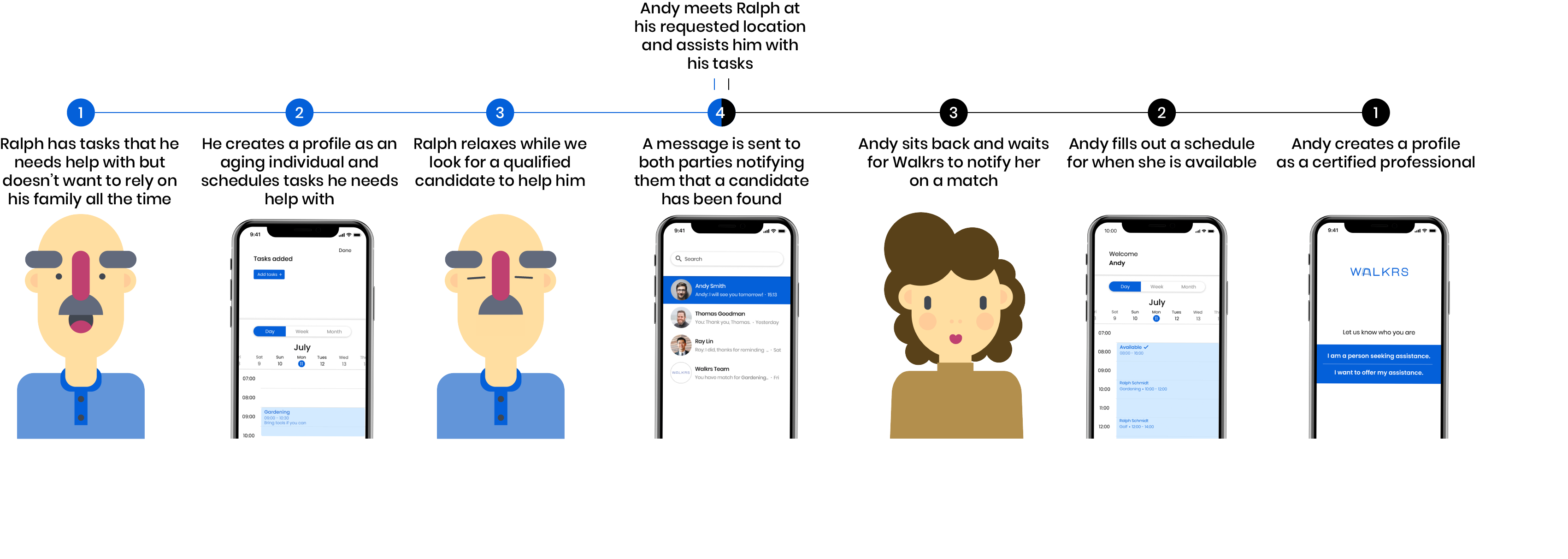
When looking through our competitors, we saw that we could offer a more consistent and reliable service through our way of scheduling. Our goal was to create a bond between the two user ends through communication and easy scheduling. To promise that, we would be acting as the mediators who would review potential candidates and help pair members up.
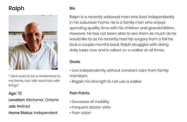
Before further getting into the design of the app, it was important to create a user persona for our elderly individual as they are the main target for our app. This persona was created through the result of many of the elderly individuals we interviewed and believe best fit our target market.
Define
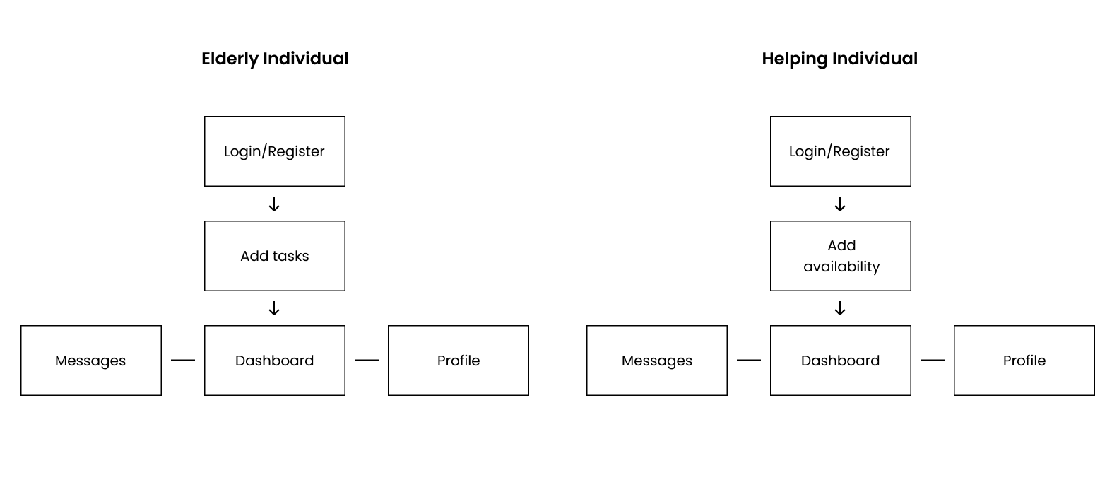
We decided on two user ends for the app because it allowed us to create simpler interfaces for users. We wanted to streamline their process to avoid any mix ups. This is the user journey maps we planned out for each end of the user.
Research
Since this project was the first time my group had to design for the elderly, we decided we needed to talk to our audience directly. Before any of the design questions were brought out, we had to find out what our target users actually wanted from an app. To find this out, my group and I went to a retirement home to interview a handful of people. We wanted to know their struggles and limitations in their daily lives. From these interviews, we came to the conclusion that they lack reliable help from a capable companion.
We conducted in person interviews at a mall during the morning hours. What we wanted to know was how to create an app that pleases the elderly. We asked questions to better understand what colours they like, contrast and sizing of text, and overall knowledge on technology.
What we got from our research is that the majority of our target users preferred comforting and calm colours such as blue and green paired with high contrast text. In terms of how knowledgeable they were with technology, many of the users were comfortable with using an app as long as it was accessible for them.
To get an idea of what makes a successful app and system similar to our project, our group looked into possible competitors. From this, we got a grasp of how our app will function.
Considerations for the app:
1. Blue or green as main colour for the app and brand with clear and contrasting colours for text.
2. Simplistic interface that is not overwhelming for less technical individuals.
3. A schedule that will keep track of all upcoming events.
4. Two user ends of the app, one for the elderly individual and one for the assisting individual.
The high fidelity mockups were completed soon after. We were able to successfully implement our considerations for the app which turned out well.
Develop
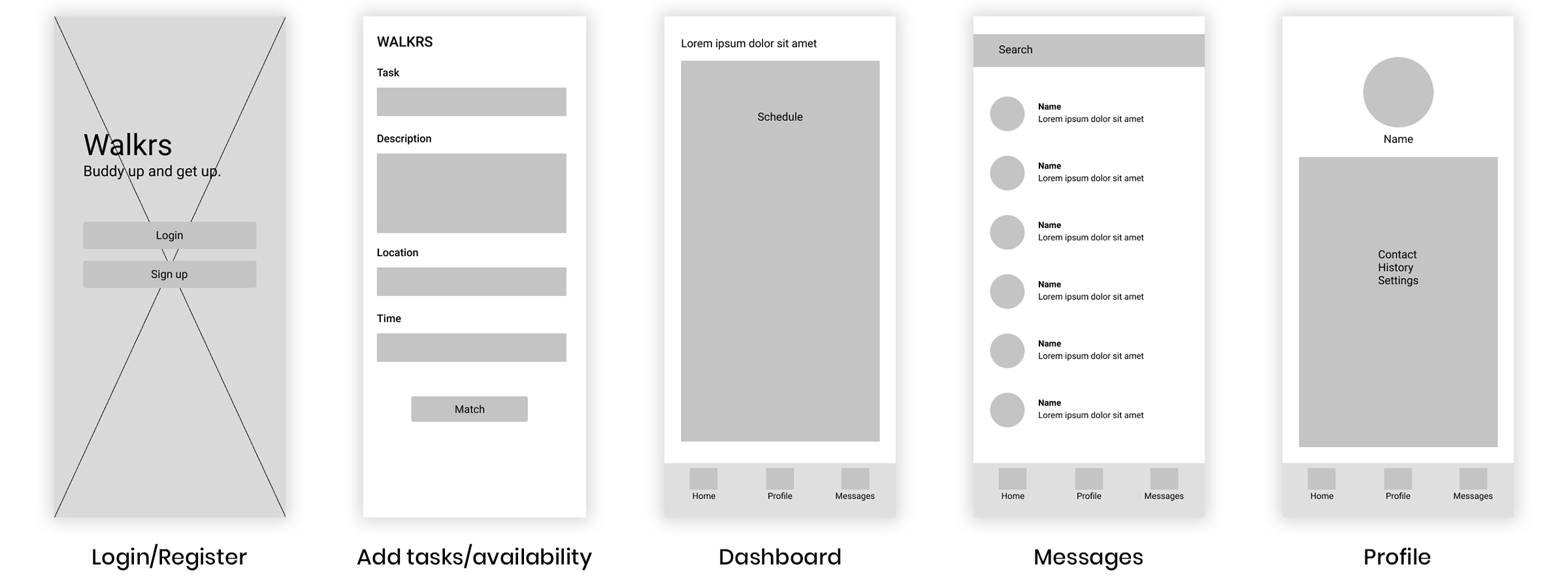
Creating the low fidelity mockups for the app was the next step. Since both sides of our app had similar pages/flow I only made one set of low fidelity mockups to represent both sides.
Add tasks or availability with ease by tapping the time slots in the schedule.
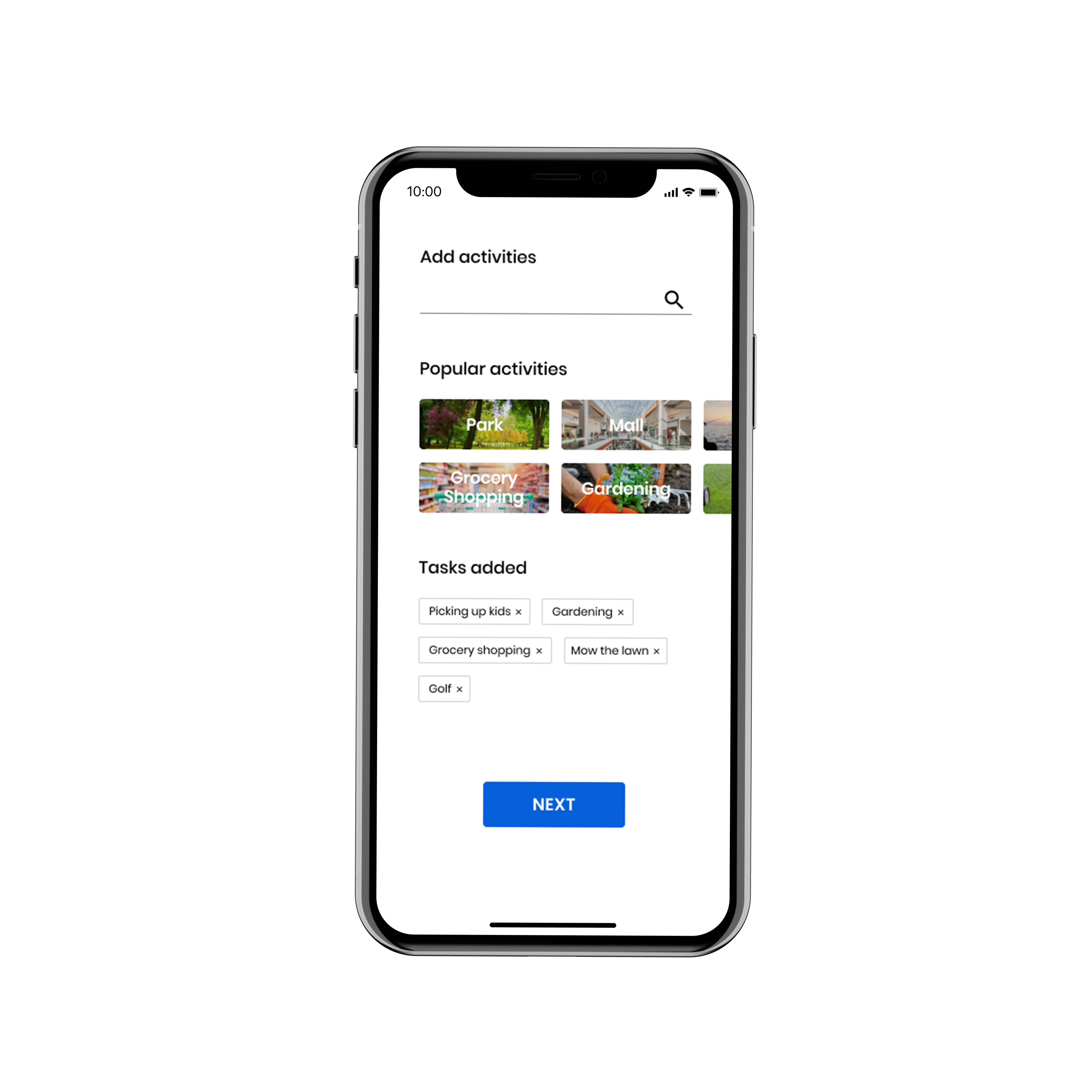
The elderly are able to add tasks through a quick search menu when they first sign up.
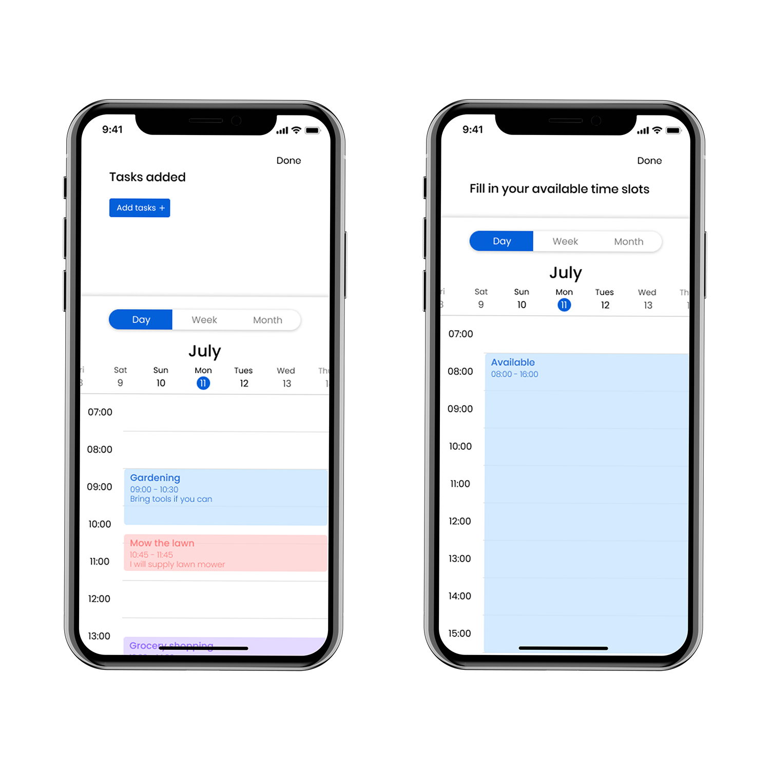
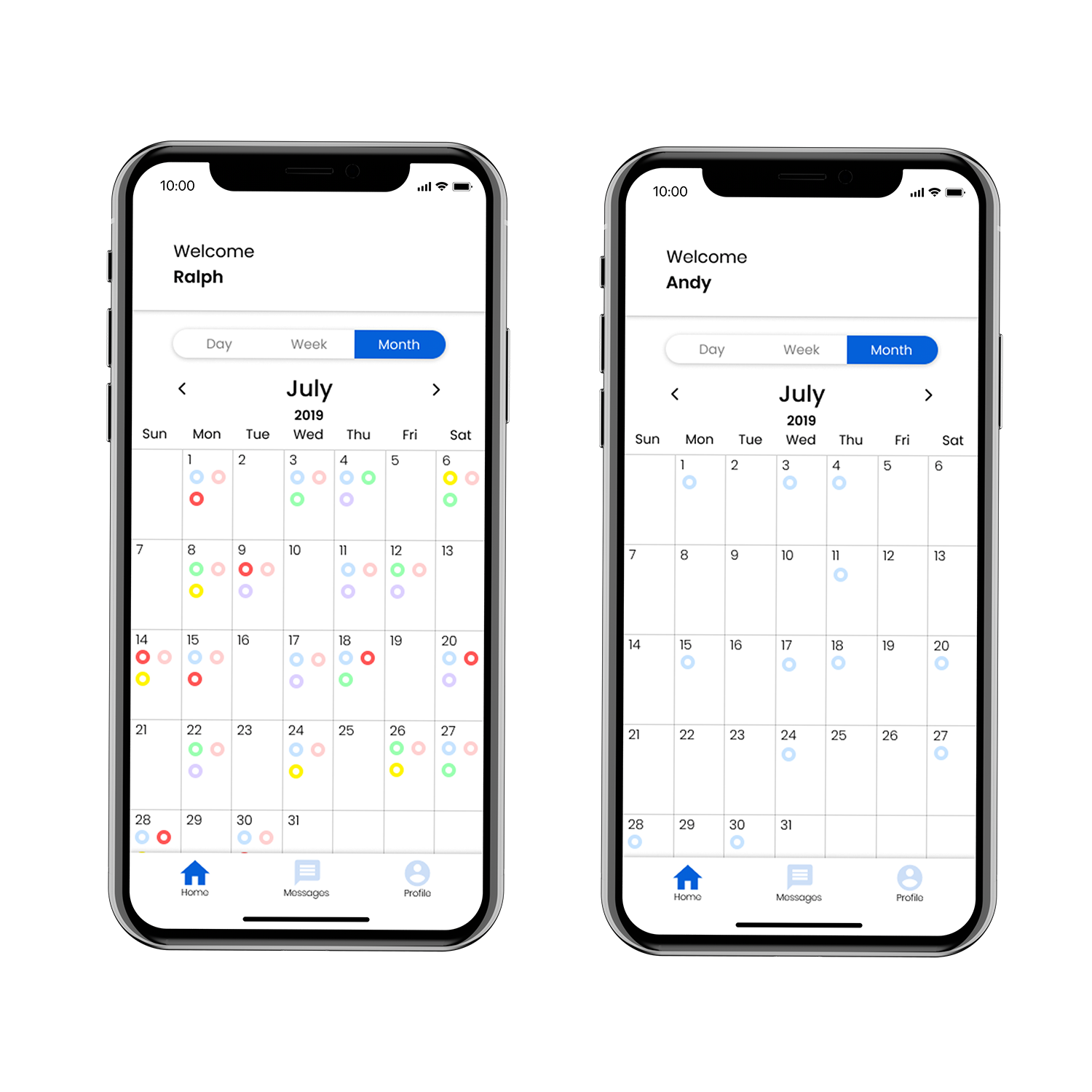
See the schedule in different calendar views from the dashboard.
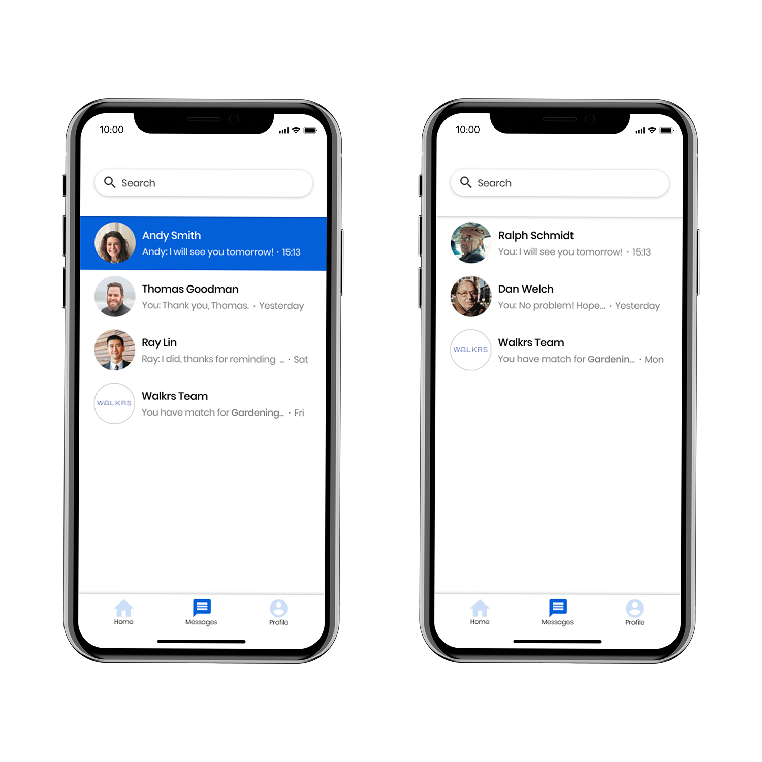
Message each other and give updates right in the app.
Deliver
When the high fidelity mockups were completed, we started on doing usability testing for both sides of the app. This helped us change anything that may not have been as clear as we imagined. Users were able to go through the entire journey without many questions if any at all. The main problems they had were not knowing what certain icons meant. These problems were fixed right away. All users found the app visually appealing and simple to use.
Here is a link to the prototype: https://invis.io/G8V1GP8TQ2K#/395752024_Register
Takeaways
The amount of research I have done for this project really showed me what it takes to make a real app for a user category that I don't fall into. I have learned that getting the primary research is what allows designers to create effective designs for specific needs. This was also the first time I utilized usability testing which was helpful in creating the final product.
I would say that I improved on a lot of things when it comes to designing in general. Being able to make choices based on user needs and adapting to different styles was greatly important. I believe that this whole experience will allow me to become the UX designer I want to be.
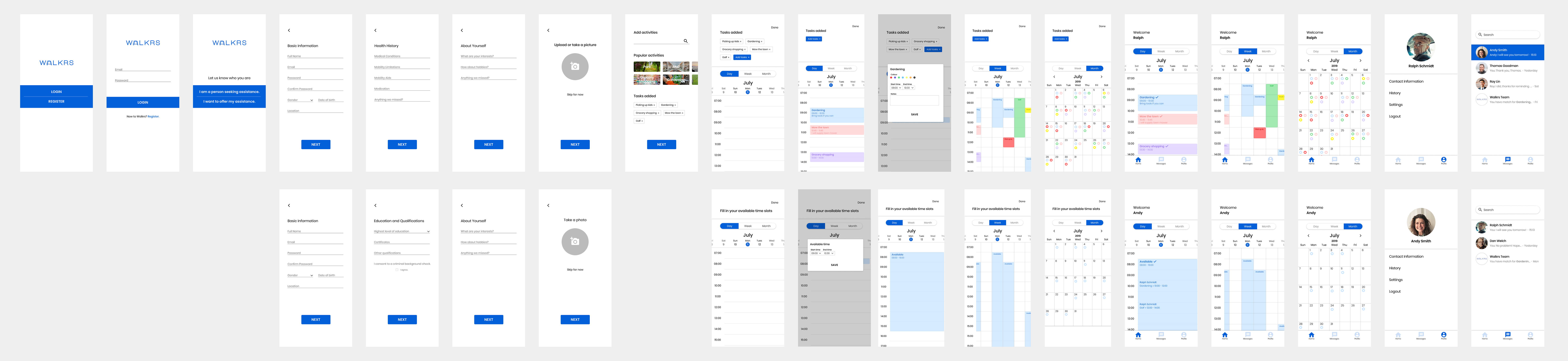
Rest of the mockups